Home
Visual Explanations: Images and Quantities, Evidence and Narrative
Barnes and Noble
Loading Inventory...
Visual Explanations: Images and Quantities, Evidence and Narrative in Bloomington, MN
Current price: $45.00
Visual Explanations: Images and Quantities, Evidence and Narrative in Bloomington, MN
Current price: $45.00
Loading Inventory...
Size: OS
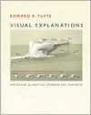
Riveting ideas on presenting better information design. Few would disagree: Life in the information age can be overwhelming. Through computers, the Internet, the media, and even our daily newspapers, we are awash in a seemingly endless stream of charts, maps, infographics, diagrams, and data.
Visual Explanations
, the latest book by Edward R. Tufte, a Yale design professor, is a navigational guide through this turbulent sea of information. The book is an essential reference for anyone involved in graphic, Web, or multimedia design, as well as for educators and lecturers who use graphics in presentations or classes.
is the third volume in Tufte's series on the science of information design. Few scholars have been able to present the theories behind this rapidly evolving field in such a fascinating, approachable, and witty manner. Like its predecessors,
Envisioning Information
and
The Visual Display of Quantitative Information
, this book is exquisitely designed and printed. It includes built-in flaps to emphasize before-and-after comparisons. With its elegant, classical typesetting and reproductions of medieval engravings, one feels like one has discovered some obscure or antiquated tome, the strange dissertations of a forgotten philosopher.
However, Tufte's ideas are contemporary and increasingly relevant: What are the most effective ways to present information?
offers numerous examples that illustrate better methods of communicating complicated ideas in print, in presentations, and on the computer screen. Tufte's critical eye is quick to suggest improvements to the examples he cites: He will often redesign a graphic or chart, and his changes offer helpful guidelines on how to put theory into practice.
The first section of the book reveals the history behind our current methods of depicting information. Many conveniences we often take for granted, such as graph paper, pie charts, and topographic maps, have evolved over the past 5,000 years as scientists and statisticians have found better ways to put onto paper the events and phenomena they observed in daily life.
The historical background in this book covers a diverse range of topics. How do we explain the illusions behind a magician's tricks? What is the best way to show the size and scale of Giacometti's sculptures? What are the shortcomings of a supercomputer's animated video of a thunderstorm? Could better organization of data have prevented the tragic explosion of the space shuttle Challenger? The second part of the book considers strategies that can be used to arrange information in a more visually exciting way, not only on the printed page but also on the video and computer screen. The daily log, or "cyclogram," drawn by a Soviet cosmonaut orbiting hundreds of miles above Earth is contrasted with the engravings of ancient astronomers. Other examples that Tufte has culled from history include a Degas sculpture, ancient letters engraved on the Trajan columns, and some mugshot photographs of criminals indicted in the Watergate conspiracy.
The latter section of the book also delves into the design of computer interfaces and Web sites, whose limited screen resolution makes the presentation of text and graphics particularly challenging. This concise discussion shows how to expand the visual capacities of the screen and is extremely helpful. For anyone who would like to better organize, manage, and present information,
is truly an enjoyable reading experience and an invaluable reference to have on your bookshelf. -- Philip Krayna