Skip to main content
Skip to navigation
Skip to navigation
Skip to sitemap
Shopping
Shopping
Directory + Map
MOA Insiders
®
Deals + Promotions
New + Opening Soon
Gift Cards
Coupon Books
Shop MOA Online
Summer
Back to School
Shopping Services
Curbside Pickup
Personal Styling
Entertainment
Attractions
Get Tickets
Attraction Bundles
Nickelodeon Universe
®
Crayola Experience
Star Express
SEA LIFE Aquarium
B&B Theatres
The Fair on 4
5D Experience
Moose Mountain Adventure Golf
Rock of Ages Blacklight Minigolf
CoComelon Playdate
Activate
The Escape Game
Great Big Game Show
Museum of Illusions
View All Attractions
Events
Birthday Parties
Toddler Tuesdays®
View All Events
Podcast
Watch
Listen
Food + Drink
Food + Drink
Dining Guide
Online Ordering + Delivery
Curbside Pickup
Happy Hours + Specials
Visit
Plan Your Trip
Hours + Directions
Book Your Hotel
Transportation
Travel Partners
Accessibility
Area Attractions
Parking
Parking at MOA
®
Valet
Electric Vehicle Charging
Getting to MOA
®
Groups
Meetings + Events
Teachers + Schools
MOA
®
Tours
Community
MOA
®
Community Foundation
Donations
First Responders Discounts
Military Discounts
Teacher Discounts
About
Security
Parental Escort Policy
Diversity
Commitment to Green
Media
Careers
Services
Family Amenities
Guest Services
Directory
My Account
Edit Profile
Favorites
Itineraries
Sign Out
Sign In
Available Parking
Attraction
Tickets
West
Parking Ramp
More Information
0%
Available Spaces
0%
FULL
East
Parking Ramp
More Information
0%
Available Spaces
0%
FULL
North Lot
Parking Available
East Lot
82nd St & 24th Ave
Closed
On Sale
Women
Men
Baby & Kids
Beauty
Home
Holiday Gift Guide
Stores
Brands
Wishlist
Wishlist
Items on Sale
Clothing
Tops
Bottoms
Outerwear
Swimwear
Sleepwear
Underwear
Dresses & Jumpsuits
Accessories
Socks
Hosiery
Hats
Headbands
Scarves
Gloves & Mittens
Sunglasses
Eyeglasses
Belts
Wallets
Watches
Jewelry
Shoes
Sneakers
Boots
Sandals
Flip Flops
Pumps
Flats
Shoe Care
Bags & Backpacks
Satchel
Messenger
Saddle
Tote
Duffel
Hobo
Clutch
Sports & Fitness
Yoga
Gym
Outdoor
Sportswear
Items on Sale
Clothing
Tops
Bottoms
Outerwear
Swimwear
Sleepwear
Underwear
Accessories
Socks
Hats
Headbands
Scarves
Gloves & Mittens
Sunglasses
Eyeglasses
Belts
Ties
Wallets
Watches
Jewelry
Shoes
Sneakers
Boots
Sandals
Flip Flops
Dress Shoes
Shoe Care
Bags & Backpacks
Messenger
Duffel
Briefcase
Luggage
Sports & Fitness
Gym
Outdoor
Sportswear
Items on Sale
Clothing
Tops
Bottoms
Outerwear
Sleepwear
Underwear
Baby Gear
Strollers
Carriers
Feeding
Seats
Cribs
Toys
Video Games
Building Toys
Puzzles
Dolls
Play Sets
Stuffed Toys
Costumes
Items on Sale
Skincare
Face Scrubs
Facial Cleansers
Essential Oils
Bath Salts
Body Wash
Makeup Remover
Moisturizers
Face Serums
Shaving Treatments
Toner
Sunscreen
After Sun Care
Makeup
Face
Eyes
Lips
Tools
Hair
Shampoo
Conditioner
Hair Treatment
Hair Color
Hair Brush
Hair Tie
Hair Towel
Hair Curler
Straightener
Hair Dryer
Nails
Nail Polish
Nail File
Items on Sale
Bedroom
Bed Sheets
Pillows
Mattress
Mattress Cover
Kitchen
Cookware
Utensils
Appliances
Office
Stationery
Paper Products
Decor
Candles
Rugs
Vase
Curtains
Wall Art
Furniture
Chairs
Sofas
Benches
Desks
Shelves
Mirrors
Electronics
Laptops
Monitors
Mice
Headphones
Speakers
Home Theatre
Cables
Batteries
Cases
Cameras
Gifts for Her
Gifts for Him
Gifts for Kids
Aerie
Aeropostale
Altar'd State
American Eagle
Ann Taylor
Apple
Arc'teryx
Athleta
Aveda
Banana Republic
Boot Barn
Boxlunch
Brighton
Buckle
Build a bear
Burberry
Carter's
Club Monaco
Coach
Cotton On
Dior @ Nordstrom
DSW
Foot Locker
Fossil
Garage
GNC
H&M
Hot Topic
Journeys
Kappa Toys
Kate Spade New York
Kay Jewelers
Legacy Toys
LL Bean
Lululemon
Lush
MAC
Macy's
Madewell
Mall Of America
Old Navy
Pac Sun
Pandora
Sephora
Skechers
Soma Intimates
Sunglass Hut
Swarovski
The Childrens Place
The Lego Store
The North Face
Timberland
Torrid
Ulta
Urban Outfitters
Vans
Zara
Zumiez
Aerie
Altar'd State
Apple
Athleta
Banana Republic
Brighton
Burberry
Dior
Fossil
Gnc
Kate Spade
L.L. Bean
The Children's Place
Torrid
Ulta
Vans
Zara
Close Button
Wishlist
Search
All Categories
Close Button
On Sale
Women
Men
Baby & Kids
Beauty
Home
Holiday Gift Guide
Stores
Brands
Search Mall of America®
The following text field will produce suggestions that follow it as you type.
Close Button
Search
Home
Barnes and Noble
Research Data Visualization and Scientific Graphics: for Papers, Presentations and Proposals
Unfortunately, this item is no longer available, but we found some similar items you might like.
You May Also Like
Wishlist
Add To Wishlist
Loading Inventory...
College Research Papers For Dummies
Barnes & Noble
Current price:
$24.99
Wishlist
Add To Wishlist
Loading Inventory...
A Manual for Writers of Research Papers, Theses, and Dissertations, Ninth Edition: Chicago Style Students Researchers
Barnes & Noble
Current price:
$38.00
Wishlist
Add To Wishlist
Loading Inventory...
The Turn of the Screw, The Aspern Papers and Two Stories (Barnes & Noble Classics Series)
Barnes & Noble
Current price:
$8.95
Wishlist
Add To Wishlist
Loading Inventory...
Scientific Graphic Function Calculator
Pursonic
Current price:
$39.99
Wishlist
Add To Wishlist
Loading Inventory...
Fugazi Research Graphic T-Shirt
Fugazi
Current price:
$65.00
Wishlist
Add To Wishlist
Loading Inventory...
Barnes & Noble The Notebook: A History of Thinking on Paper by Roland Allen
Barnes & Noble
Current price:
$19.95
Wishlist
Add To Wishlist
Loading Inventory...
the MIND Diet: 2nd Edition: A Scientific Approach to Enhancing Brain Function and Helping Prevent Alzheimer's Dementia, Fully Updated with New Recipes, Meal Plans, More Tips Tools Based on Latest Research
Barnes & Noble
Current price:
$16.95
Wishlist
Add To Wishlist
Loading Inventory...
Damson Madder Paper Dolls Long-Sleeve Graphic Tee
Damson Madder
Current price:
$83.00
Wishlist
Add To Wishlist
Loading Inventory...
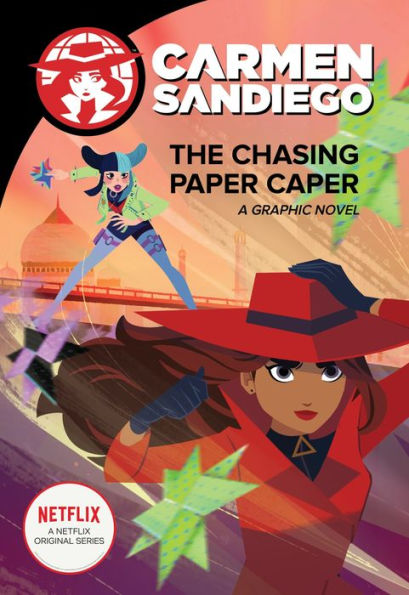
Chasing Paper Caper (Carmen Sandiego Graphic Novels Series)
Barnes & Noble
Current price:
$21.99
Wishlist
Add To Wishlist
Loading Inventory...
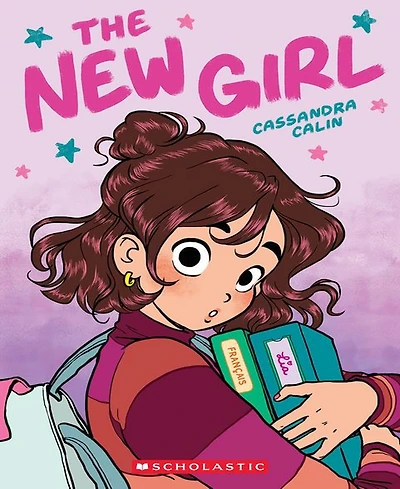
Barnes & Noble The New Girl: A Graphic Novel The New Girl 1 by Cassandra Calin
Barnes & Noble
Current price:
$10.99
Wishlist
Add To Wishlist
Loading Inventory...
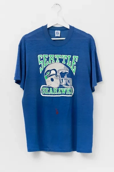
Vintage 1980s Seattle Seahawks Distressed Paper Thin Graphic T-Shirt
Urban Outfitters
Current price:
$110.00
Sale
Wishlist
Add To Wishlist
Loading Inventory...
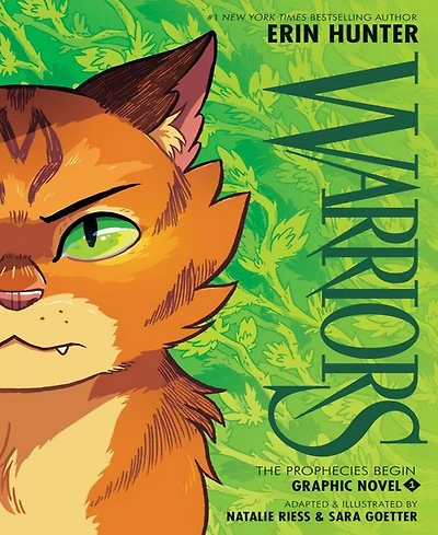
Barnes & Noble Warriors Graphic Novel: The Prophecies Begin 1 by Erin Hunter
Barnes & Noble
Current price:
$15.99
Wishlist
Add To Wishlist
Loading Inventory...
Vintage 1980s UC Berkeley Distressed Paper Thin Graphic T-Shirt Made in USA
Urban Outfitters
Current price:
$120.00
Sale
Wishlist
Add To Wishlist
Loading Inventory...
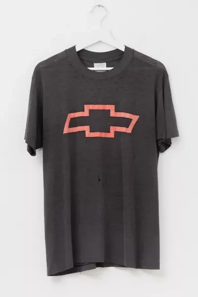
Vintage 1980s Distressed Chevy Heart Beat of America Paper Thin Graphic T-Shirt
Urban Outfitters
Current price:
$150.00
Sale
Wishlist
Add To Wishlist
Loading Inventory...
The U.S. Constitution and Other Important American Documents (No Fear)
Barnes & Noble
Current price:
$7.99
Wishlist
Add To Wishlist
Loading Inventory...
Metallic Twisted Front Top
red by BKE
Current price:
$21.47
CHAT
×
Focus trap